
Dawn Hill Ranch Packaging
The private estate of Dawn Hill Ranch (DHR) produces small-batch olive oil and wine every year. Since it’s inception, I have been their sole designer for anything from logo design to wine and olive oil labels. Custom illustrations and graphics included. For full disclosure, I did accept boxes of wine and olive oil as a portion of my payment with utter delight.
Branding / Creative Direction / Design / Illustration / Print Production

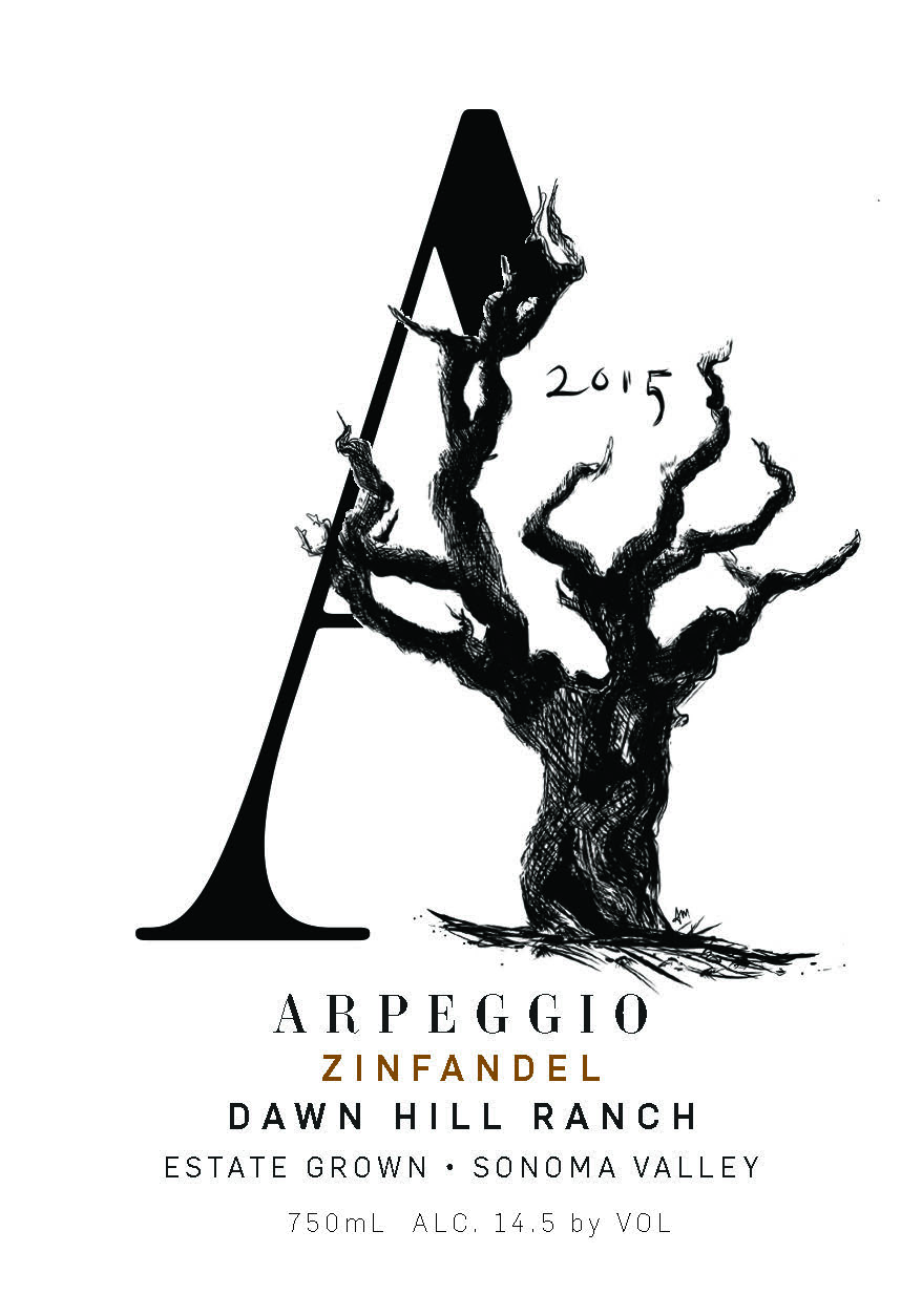
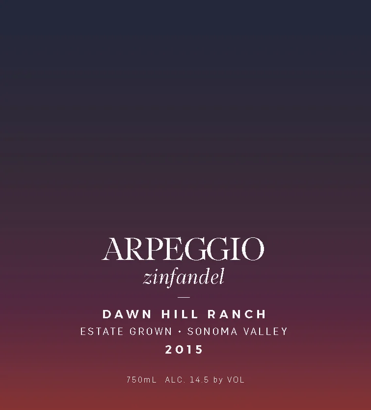
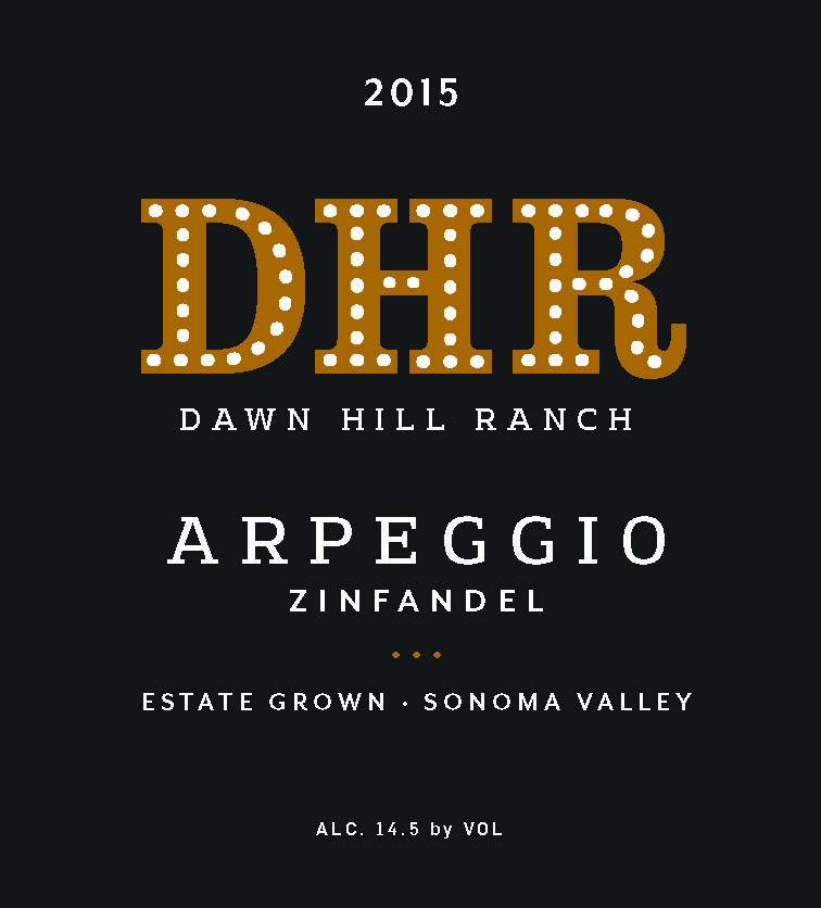
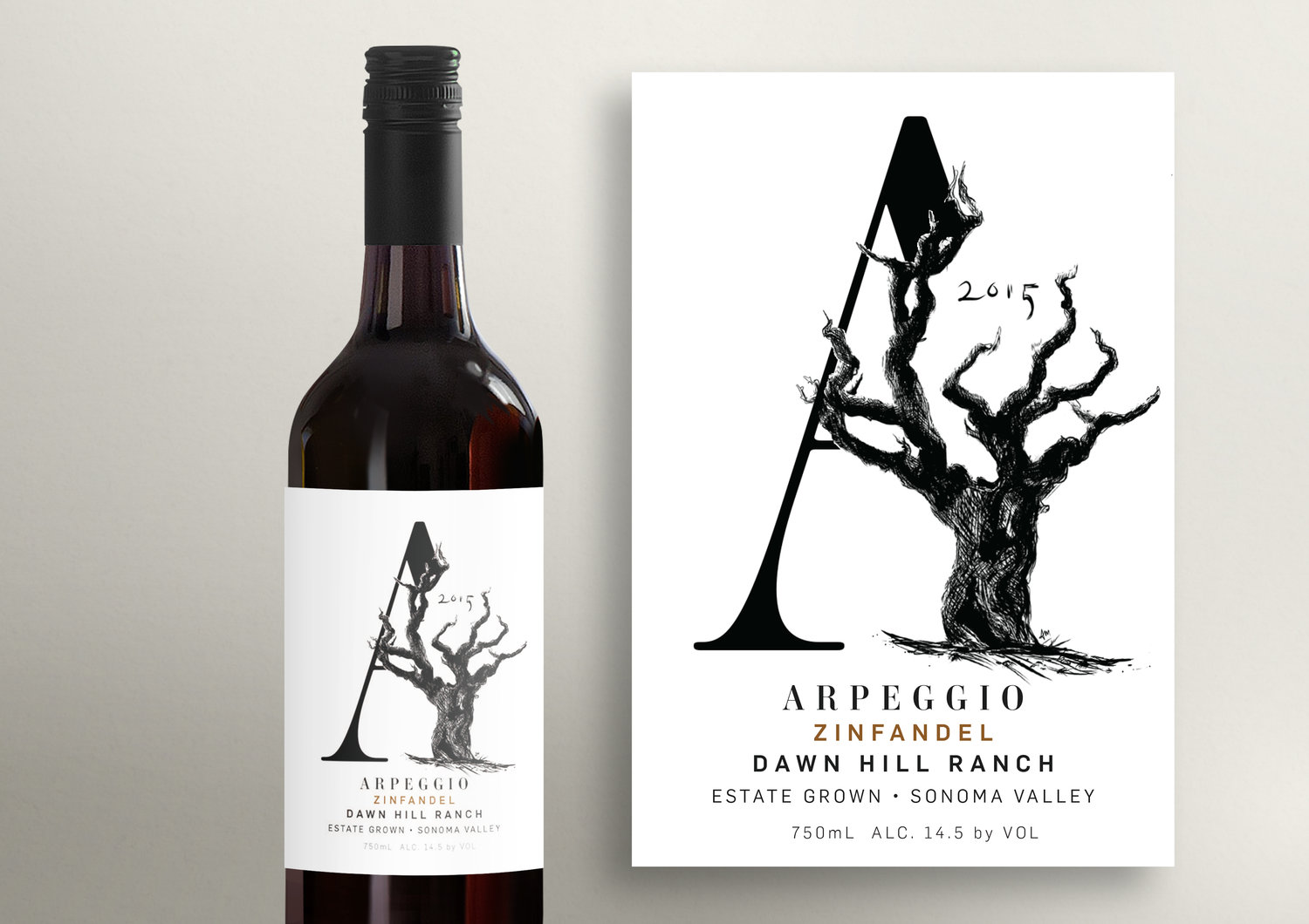
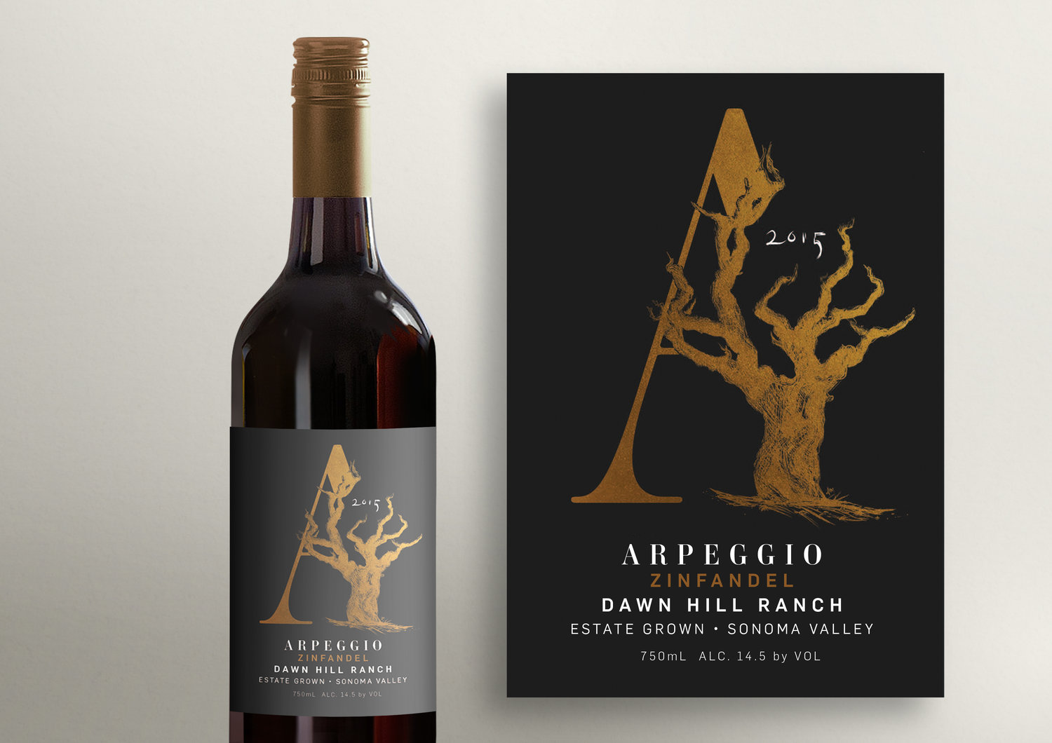
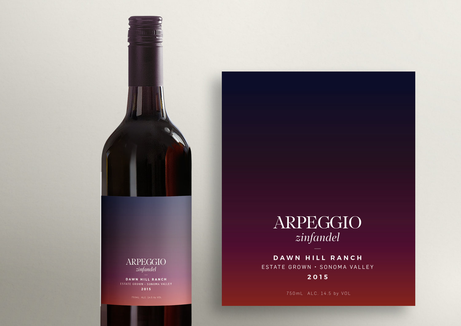
FINAL WINE LABEL DESIGN, 2017
Round 1: Brief to Comps
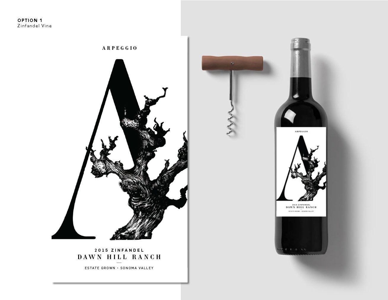
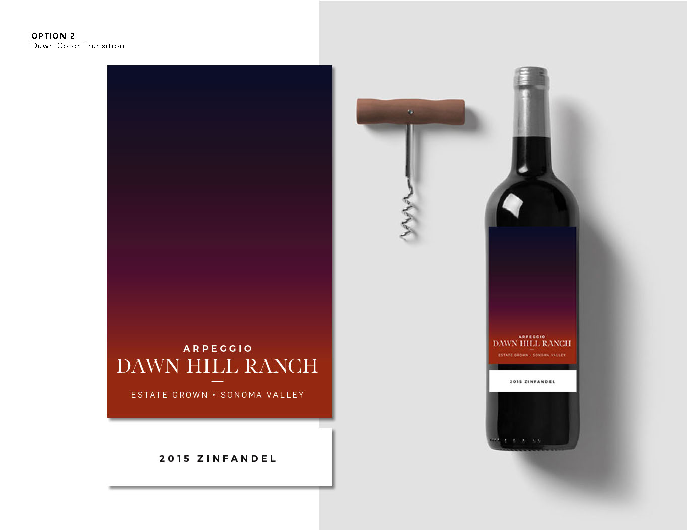
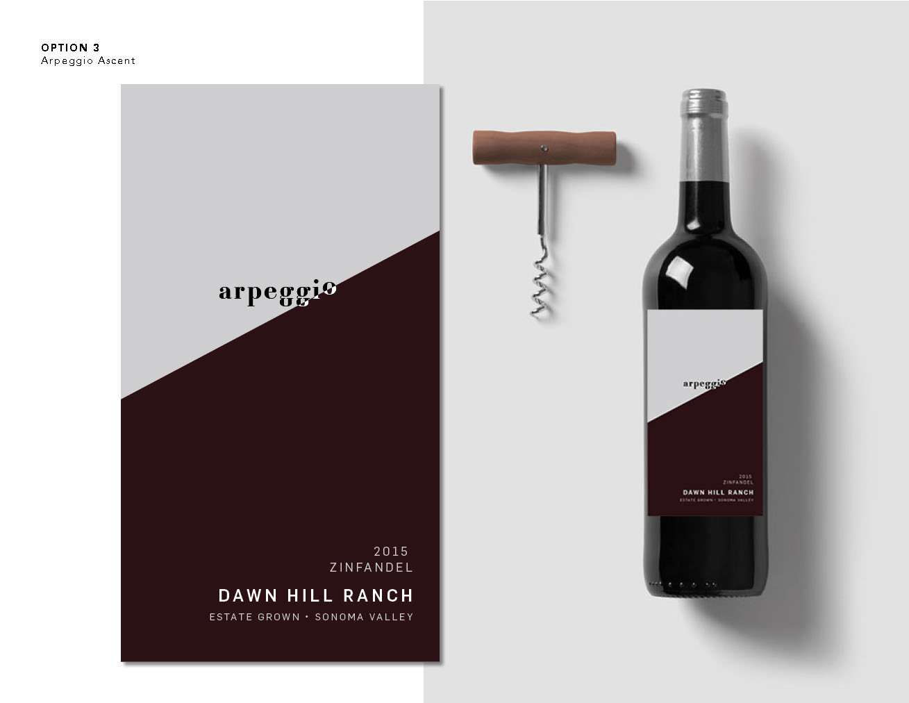
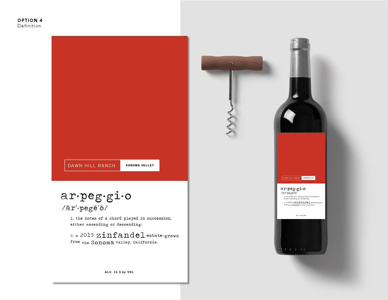
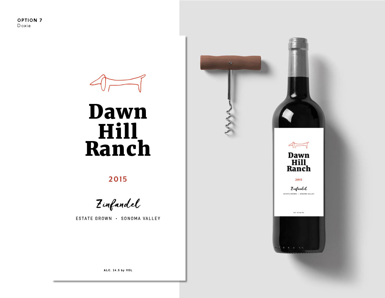
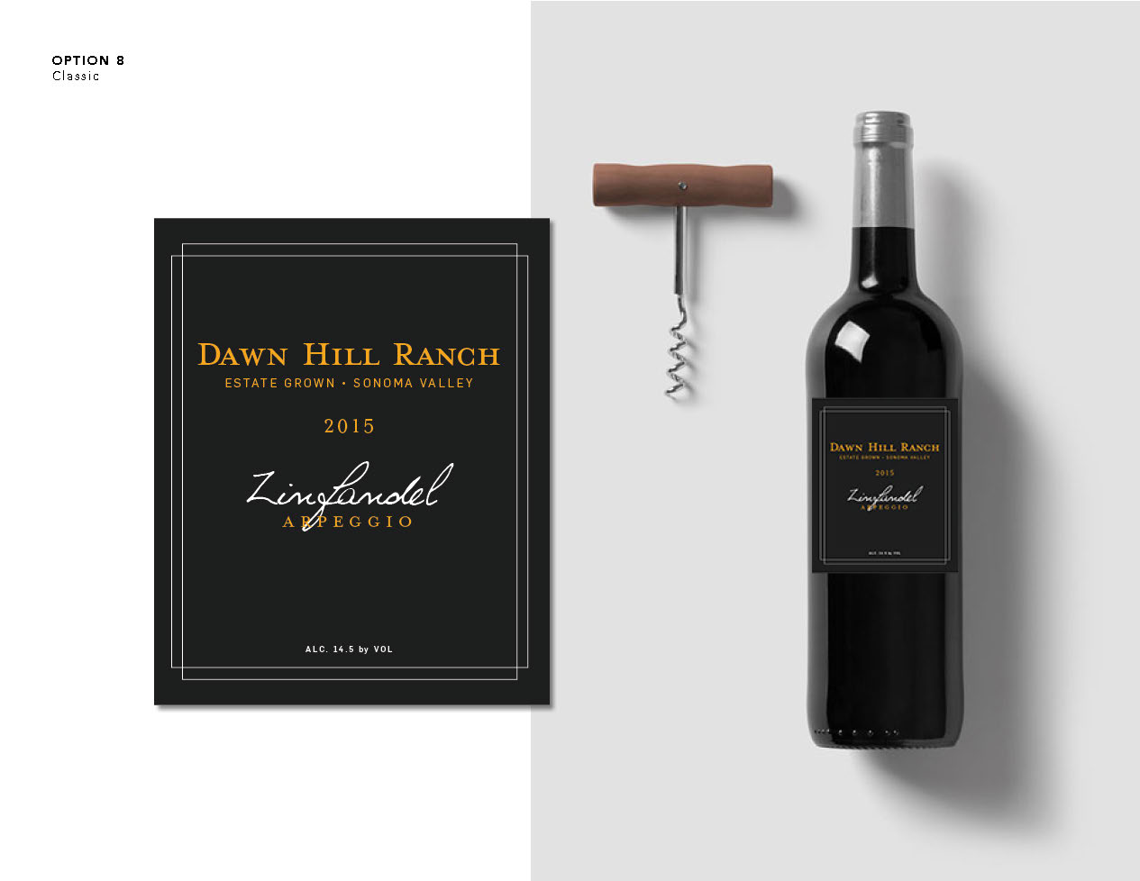
When DHR first asked me to design the wine labels for their inaugural vintage, they started with a wide range of disparate ideas, plus a certainty they would know what they liked when they saw it. The collection of ideas they gave included “Arpeggio + musical notes”; “Head Trained Zinfandel Vines”; “Graphic and bold color”; and “Black with gold writing”. Without any branding or prior designs to go off of, the first round was truly a wide-open field of options.
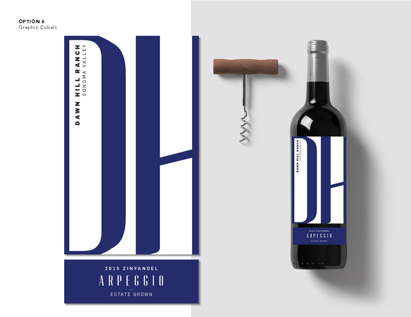
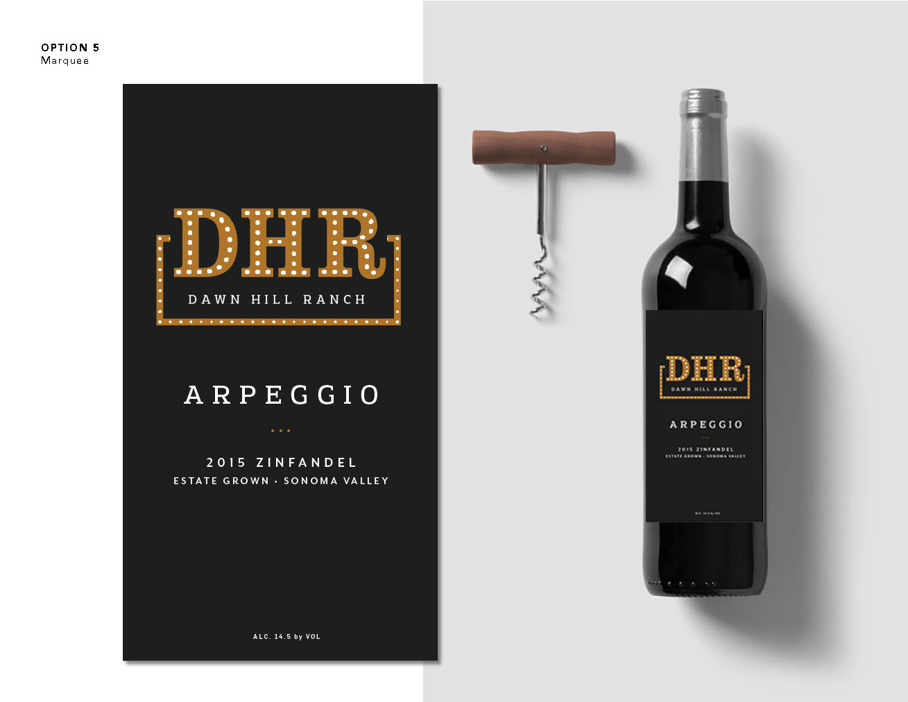
Round 2: Typography, Illustration & Graphics
I progressed three designed after their selection of R1 options 1 (old vine), 2 (dawn) and 6 (marquee). The first got it’s very own custom illustration (admittedly not my strength but was very pleased with the end result)—my signature initials tucked discreetly into the bottom right of the vine. The second received a fresh type hierarchy with a bold serif tracked tight. Additionally, I shifted the gradient for a more velvety color transition. The third and final option got its graphics polished up and tightened.
The Final Product
In the end, they loved each of these so much they couldn’t pick just one, so they decided to use all three! The old vine got two print treatments—black on white, and gold on black. Dawn was printed as-is. The Marquee became their vineyard logo.

FINAL OLIVE OIL LABEL, 2017
The Olive Oil Label
In addition to wine, DHR produces its very own extra virgin olive oil. For this label, the client was very explicit about the retro infographic design they wanted, and the colors based off the deep reddish browns and greens of marinated olives. They gave me the notes about their olive oil production to play with and I went from there. Though the design was dictated carefully, I was still able to surprise them with the added detail of owner’s graceful signature printed at the bottom for a personal touch. I’d scanned it and cleaned it up from an actual note she’d once sent me.